
How to Design a Business card
- Joice Espejo
- Nov 27, 2020
- 7 min read

Updated: Dec 1, 2020
Here's what you need to know to have an impressive Business card.
By: Joice Espejo |December 1, 2020
Although we’re working in paperless offices more and more, the business card is still a mainstay of business. If you haven’t got a card that you can hand out to prospective clients or collaborators, you’re missing out on a key marketing opportunity.
“Do you have a design in mind for your Business card? Whether you prefer a trendy postcard look or you’re going for a more editorial style blog - there’s a stunning layout for everyone.”
Know Thyself
There’s one other preliminary activity that makes the rest of the business card design process run more smoothly. You need to know what you want to communicate. What kind of brand are you, as an individual or business? What do you want your business card to say, not just with words, but with the design?
This is also a topic worthy of its own discussion, so if you want to dive deeper, here’s a shortlist of questions to ask yourself for determining your personal brand identity. Taking a few minutes of reflection about your personal brand will help with some business card design questions down the line, particularly when it comes to displaying your personality.
Once you have your logo, brand color scheme, and a good idea of what you want your card to say about you, you’re ready to start. Just follow the 8 steps below to determine which business card design would work best for you.

1. Choose your shape
If you’ve already decided on a traditional rectangular business card, you can skip ahead to the second step. If, however, you want to learn about all your options, even outside-the-box strategies, keep reading.
As printing techniques grow more advanced and affordable, professionals have more room to explore alternative shapes. The printing technique of die-cutting allows you to cut out any shape you want and still print in bulk.
On the conservative end of the spectrum, you could simply round the corners for a friendlier business card.
But if you really want to be playful or stand-out, you can use virtually any shape: animal mascots, outlines of products your sell, or a shape that’s wholly original.
2. Choose you size
Your next decision is the size of the card. This mostly depends on the standard of the country, so that’s a good place to start. Even if you plan to stand out, you have to know what everyone else is doing to go against it.
North American Standard: 3.5 × 2 in. (88.9 × 50.8 mm)
European Standard: 3.346 × 2.165 in. (85 × 55 mm)
Oceania Standard: 3.54 × 2.165 in. (90 × 55 mm)
No matter the size, you always want to consider three factors when designing:
Bleed area: the outermost part of the card likely to be removed.
Trim line: the target line for cutting cards.
Safety line: anything outside this line is subject to cutting mistakes. Don’t let essential elements like text or logos fall outside this line.
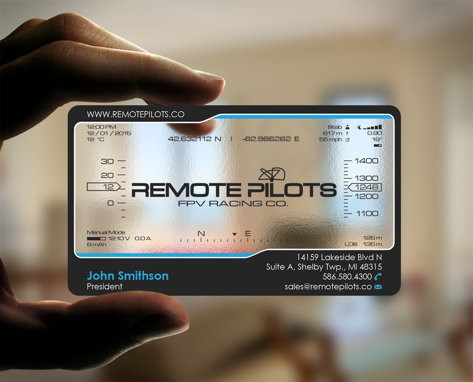
3. Add your logo and other graphics
Now we begin plotting the visual elements of your business card design, first and foremost the logo. Your logo should take center stage on your business card, although other flourishes and secondary graphics can sometimes be useful as well.
Don’t forget that you have two sides at your disposal. One strategy is to dedicate one side of the business card exclusively to the logo, while the other side showcases the contact information of the person. However, it’s also good to have the logo on both sides, so often you’ll see a smaller, out-of-the-way logo on the side with contact information, as with Omni above.
This is just one strategy of many, though, so feel free to experiment with logo placement until you find one for your tastes.


While minimalism is a popular choice for business cards, if that empty space doesn’t suit you, you can fill it with additional graphics. In an industry like children’s clothing, Londees wants to take its cute theme as far as it will go: they expand on their sheep mascot by placing sheep doodles all over, and use a faded background to avoid clutter (also notice the use of soft blue, a playful and kid-friendly color). Even if your logo is simple or text only, any related imagery serves the same ends.
Additional graphics work well for showing off your brand identity. Without explicitly saying it, you can communicate your or your brand’s personality through visuals, including colors. For example, if you want to seem casual or approachable, a cute cartoon and some bright colors would do the trick.
4. Add necessary text
What your business card actually says depends on you. Work-from-home freelancers may have no need for a postal address, while professions that consult face-to-face require it. Or maybe it’s a strategic choice, such as drawing attention to your impressive social media following. The point is, different people benefit from different text on their business cards.
So the next step is for you to decide what to put on your business card. Below is a list of some common choices, so you can decide which to include and exclude.
Name – A given. Every card needs a name.
Company name – Another given, except for personal brands, in which case your personal name is your company name.
Job title – For traditional cards, include your job title. This also helps remind the holder of who you are, what you do, and even how your met.
Phone number – Even if phone is not your preferred method of communication, it is to some people.
Email – A business card staple; email is the new norm for non-urgent business communications, partially because it allows sending documents as attachments.
Website URL – Including your site URL is a non-aggressive invitation for visits.
Social media – If social media is relevant to your field, or you just want to show a bit of your personality, include social media links.
Address – Necessary for drawing customers into your office or store location.
QR code – While not as popular as years past, a QR code is still a viable shortcut to transferring whatever data you desire.
Slogan – Completely optional, a slogan helps with brand identity and adds a little personality.
Remember that business cards aren’t just about giving information but also retaining it. People may already know your number, address, or URL, but keep your card handy in case they forget it.
5. Choose your typography
Once you know what you want to say, you can choose how it looks. While typography is always important, it’s especially pertinent to business cards since you have to make text completely legible and have only a small space to work with.
Let’s break up typography into three main categories:
Size. To maintain readability, you want all your text to be at least 8 pts. However, you want your most important elements (like your name) to stand out, so feel free to vary the text sizes. Also consider empty space—you don’t want to clutter your card, so leave your text small enough that there’s plenty of breathing room around each element.
Font. We’ve already spoken at length about fonts and how they influence your brand identity, so feel free to check out The 5 types of fonts and how to use them for a more in-depth treatment. Just remember to choose a font that represents the personality you’re going for. A clean and modern sans-serif, an individualistic and elegant script or a classic and timeless serif font? Below are some examples of what different font styles bring to the table.


Color. Here’s where a pre-existing brand color scheme comes in handy. Staying on-brand, choose text colors that go well with the background color of your card, which should also be a brand color. Similar colors may look nice together but can be hard to read, so experiment with contrasts for legibility.


6. Consider special finishes
Now that you’re reaching the final stretch, it’s time to start considering printers—especially in terms of what they can offer. Certain printers offer special finishes that can go a long way in making a lasting impression. See if any of these “special effects” can benefit your business card design strategy.
Embossing. This technique creates three-dimensional reliefs, making certain areas “pop out.” Like spot UV coating, you can use it to draw attention to specific aspects of your card, even words.
Letterpressing. Rather than raising the paper, letterpress printing pushes the paper down while inking it. The result is something like an engravement, typically with special ink to draw further attention. Especially useful for letters, giving your words a heightened gravitas.
Foil stamping. If you want something shiny and reflective like tin foil, you can apply foil stamping to images or even just parts of images. This also works for accenting text, if you’ve chosen a bold enough typeface.
Spot UV coating. A lot of cards have a sleek varnish to create a sheen and smooth texture. Spot UV coating is the same thing, except only applied to certain areas. That means you can apply a gloss on only your logo, specific graphics, or even a word or phrase. Use it when you want to accent certain areas over others, but be mindful of how it affects the overall composition when only a portion is shiny.
7. Pick a designer
If you really want a stellar business card, it’s a good idea to find a professional designer who can create the perfect card for you. You can look for a local freelance designer or search on a platform like 99designs for a designer with the right style and experience. Make sure to check out their portfolio to see if they’re a good fit for your brand.
Once you’ve found the right person, try to communicate clearly what your business is all about and what style and vibe you are looking for, so your designer can turn your vision into reality.


8. Finalize your design
With all the elements in place and an accurate prediction of your final color choices and special finishes, you can reevaluate your design to make sure everything works.
First, examine the visual flow: how does your eye move when looking at the card. What do you notice first? Last? A good visual flow should start with the logo, then the name, and then the secondary information, finishing on any secondary images if they’re there. You can always change and optimize the visual flows by changing an element’s size and location.
You also want to clear out as much clutter as you can. Is all the information necessary? The fewer the remaining elements, the more impact each makes.
Double-check to make sure you didn’t fall into any common pitfalls. Is the text legible? Do the colors clash? Are any elements too close to the edge?


The author
Matt Ellis is a freelance content writer, specializing in web design and ecommerce. For over a decade he's been sharing his industry knowledge through ebooks, website copy, and blog articles just like this one. You can learn more about his career and writing services at https://www.mattelliscontentwriter.com/.

Comments